This one’s fascinating to me. I’ve seen several otherwise unrelated articles about LA’s parking sign redesign, and each had a negative spin. What drops my jaw is that the new signs, to me, are a vast improvement. Finally, at a glance, I can see exactly where I am right now, and where I’m not supposed to be. Looking at the comments, you’ll see the split. Some people like the new signs (with the usual quibbles about color, etc.), and others are responding as if LA had posted signs of Hitler waving an American flag.
Here’s what the controversy is about:
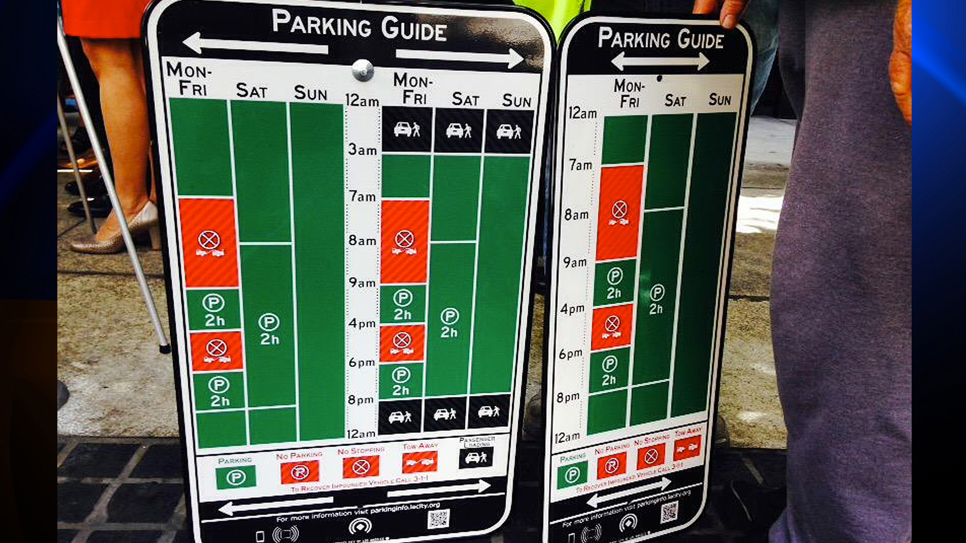
It’s such a clear improvement over what I’ve had to endure before that I have to imagine that there are some people who aren’t seeing the same things I’m seeing. Am I so far to one side of the visual spectrum that I need the week to be laid out into logical, contextually-accurate zones in order to interpret a sign correctly? Perhaps. Regardless, score one for visual savants!